Installation
NPM/Yarn
NPM combined with a tool like Browserify or Webpack is the recommended method of installing SweetAlert.
npm install sweetalert --saveThen, simply import it into your application:
;CDN
You can also find SweetAlert on unpkg and jsDelivr and use the global swal variable.
Getting started
Showing an alert
After importing the files into your application, you can call the swal function (make sure it's called after the DOM has loaded!)
;If you pass two arguments, the first one will be the modal's title, and the second one its text.
;And with a third argument, you can add an icon to your alert! There are 4 predefined ones: "warning", "error", "success" and "info".
;Using options
The last example can also be rewritten using an object as the only parameter:
;With this format, we can specify many more options to customize our alert. For example we can change the text on the confirm button to "Aww yiss!":
;You can even combine the first syntax with the second one, which might save you some typing:
;For a full list of all the available options, check out the API docs!
Using promises
SweetAlert uses promises to keep track of how the user interacts with the alert.
If the user clicks the confirm button, the promise resolves to true. If the alert is dismissed (by clicking outside of it), the promise resolves to null.
;This comes in handy if you want to warn the user before they perform a dangerous action. We can make our alert even better by setting some more options:
iconcan be set to the predefined"warning"to show a nice warning icon.- By setting
buttons(plural) totrue, SweetAlert will show a cancel button in addition to the default confirm button. - By setting
dangerModetotrue, the focus will automatically be set on the cancel button instead of the confirm button, and the confirm button will be red instead of blue to emphasize the dangerous action.
;Advanced examples
Customizing buttons
We've already seen how we can set the text on the confirm button using button: "Aww yiss!".
If we also want to show and customize the cancel button, we can instead set buttons to an array of strings, where the first value is the cancel button's text and the second one is the confirm button's text:
;If you want one of the buttons to just have their default text, you can set the value to true instead of a string:
;So what if you need more than just a cancel and a confirm button? Don't worry, SweetAlert's got you covered!
By specifying an object for buttons, you can set exactly as many buttons as you like, and specify the value that they resolve to when they're clicked!
In the example below, we set 3 buttons:
cancel, which by default resolves tonulland has a custom"Run away!"text.catch, which will resolve to thevaluewe've specified ("catch") and has the custom text"Throw Pokéball!".defeat. Here, we specifytrueto let SweetAlert set some default configurations for the button. In this case, it will set thetextto"Defeat"(capitalized) and the resolved value todefeat. Had we set thecancelbutton totrue, it would still resolve tonullas expected.
;You can check out all the available button options in the docs.
AJAX requests
Since SweetAlert is promise-based, it makes sense to pair it with AJAX functions that are also promise-based. Below is an example of using fetch to search for artists on the iTunes API. Note that we're using content: "input" in order to both show an input-field and retrieve its value when the user clicks the confirm button:
;Using DOM nodes as content
Sometimes, you might run into a scenario where it would be nice to use the out-of-the box functionality that SweetAlert offers, but with some custom UI that goes beyond just styling buttons and text. For that, there's the content option.
In the previous example, we saw how we could set content to "input" to get an <input /> element in our modal that changes the resolved value of the confirm button based on its value.
"input" is a predefined option that exists for convenience, but you can also set content to any DOM node!
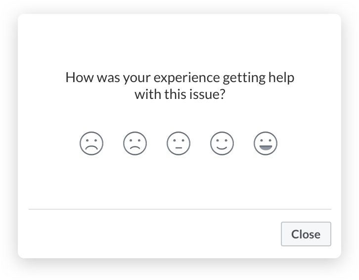
Let's see how we can recreate the functionality of the following modal...
;...using a custom DOM node!
We're going to use React here, since it's a well-known UI library that can help us understand how to create more complex SweetAlert interfaces, but you can use any library you want, as long as you can extract a DOM node from it!
;; const DEFAULT_INPUT_TEXT = ""; { superprops; thisstate = text: DEFAULT_INPUT_TEXT ; } { let text = etargetvalue; this; /* * This will update the value that the confirm * button resolves to: */ swal; } { return <input value=thisstatetext onChange=thischangeText /> } // We want to retrieve MyInput as a pure DOM node: let wrapper = document;ReactDOM;let el = wrapperfirstChild; ;This might look very complex at first, but it's actually pretty simple. All we're doing is creating an input tag as a React component. We then extract its DOM node and pass it into under the swal function's content option to render it as an unstyled element.
The only code that's specific to SweetAlert is the swal.setActionValue() and the swal() call at the end. The rest is just basic React and JavaScript.
Using with libraries
While the method documented above for creating more advanced modal designs works, it gets quite tedious to manually create nested DOM nodes. That's why we've also made it easy to integrate your favourite template library into SweetAlert, using the SweetAlert Transformer.
Using React
In order to use SweetAlert with JSX syntax, you need to install SweetAlert with React. Note that you need to have both sweetalert and @sweetalert/with-react as dependencies in your package.json.
After that, it's easy. Whenever you want to use JSX in your SweetAlert modal, simply import swal from @sweetalert/with-react instead of from sweetalert.
The JSX syntax replaces the modal's content option, so you can still use all of SweetAlert's other features. Here's how you could implement that Facebook modal that we saw earlier:
const onPick = { } const MoodButton = <button data-rating=rating className="mood-btn" onClick= /> Upgrading from 1.X
SweetAlert 2.0 introduces some important breaking changes in order to make the library easier to use and more flexible.
The most important change is that callback functions have been deprecated in favour of promises, and that you no longer have to import any external CSS file (since the styles are now bundled in the .js-file).
Below are some additional deprecated options along with their replacements:
- When using a single string parameter (e.g.
swal("Hello world!")), that parameter will be the modal'stextinstead of itstitle. typeandimageUrlhave been replaced with a singleiconoption. If you're using the shorthand version (swal("Hi", "Hello world", "warning")) you don't have to change anything.customClassis nowclassName.imageSizeis no longer used. Instead, you should specify dimension restrictions in CSS if necessary. If you have a special use case, you can give your modal a custom class.showCancelButtonandshowConfirmButtonare no longer needed. Instead, you can setbuttons: trueto show both buttons, orbuttons: falseto hide all buttons. By default, only the confirm button is shown.confirmButtonTextandcancelButtonTextare no longer needed. Instead, you can setbutton: "foo"to set the text on the confirm button to "foo", orbuttons: ["foo", "bar"]to set the text on the cancel button to "foo" and the text on the confirm button to "bar".confirmButtonColoris no longer used. Instead, you should specify all stylistic changes through CSS. As a useful shorthand, you can setdangerMode: trueto make the confirm button red. Otherwise, you can specify a class in the button object.closeOnConfirmandcloseOnCancelare no longer used. Instead, you can set thecloseModalparameter in the button options.showLoaderOnConfirmis no longer necessary. Your button will automatically show a loding animation when itscloseModalparameter is set tofalse.animationhas been deprecated. All stylistic changes can instead be applied through CSS and a custom modal class.type: "input",inputType,inputValueandinputPlaceholderhave all been replaced with thecontentoption. You can either specifycontent: "input"to get the default options, or you can customize it further using the content object.htmlis no longer used. Instead use the content object.allowEscapeKeyis nowcloseOnEscfor clarity.allowClickOutsideis nowcloseOnClickOutsidefor clarity.